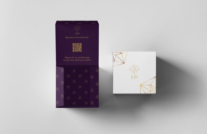
Scry Crystal Subscription Box
For this project, we were asked to create a branding project that made the customer feel like the "hero" when using or buying the product. As crystal practice is a complicated world that is often expensive and hard to enter as a beginner, I come up with the idea of a fictitious subscription box company with the aim to help make this process easier. Thus, Scry. My main focus design-wise was to create a logo that encapsulated the symbols of crystal practice, unique and eye-catching packaging, and informational cards that came with each box to help users learn more about their crystals as well as how to use them.
Iteration


The first started off my process with sketching. I drew out versions of the logo as well as laid out the design of both the cards and packaging. I also sketched out the illustrative pieces for the packagings pattern as well as the pieces that would embellish the cards.

Once I decided on color pallets and type-faces, I layout out the packaging flat in Illustrator. This allowed me to make sure each piece was just wanted I wanted before displaying it on a 3D mockup.


The same process was then carried out for each card. The colors though were directly pulled from each crystal, making each card's design unique to it's stone. Each card also has quick facts for the user to look back on when learning how to use their crystals. This includes: their mineral makeup, origin, planetary, zodiac, and elemental alignment, and how to best use them in practice. Each illustrative decoration piece is also pulled from the logo, connecting it back visually to the brands image and packaging style wise.


